The Challenge
Newly qualified nutritionist, Parveen, tasked us with producing a visual identity for her newly established brand, PRK Nutrition. Although Parveen was unsure as to what she wanted design wise, her brief was to produce a brand that is professional, but equally friendly and approachable.
Following brand production, we were also tasked with producing an online home for the new business, with Squarespace as the chosen provider.
“From start to finish you have made the whole process of building my website a pleasure. Your prompt response and attention to detail have been outstanding.”


Our Approach
We kicked the process off with some competitor research, followed by a brand proposal. The typefaces chosen include a bold but pretty serif font in lower case to give the brand a softer feel, combined with an elegant sans-serif typeface to give it that modern but professional look. The subtle inclusion of the leaf gives it that instant nod towards nutrition but without becoming too gimmicky.
The colours that make up the brand palette are warming, and being some of Parveen’s favourite’s, they help to add a bit of her personality to the branding - combining a sapphire blue, bottle green, white and a hint of gold.
Once the branding was finalised, we then moved to Squarespace.
“After a little hand-over, the website is now easily updatable for Parveen, giving her full control of the content that sits online.”

The Detail
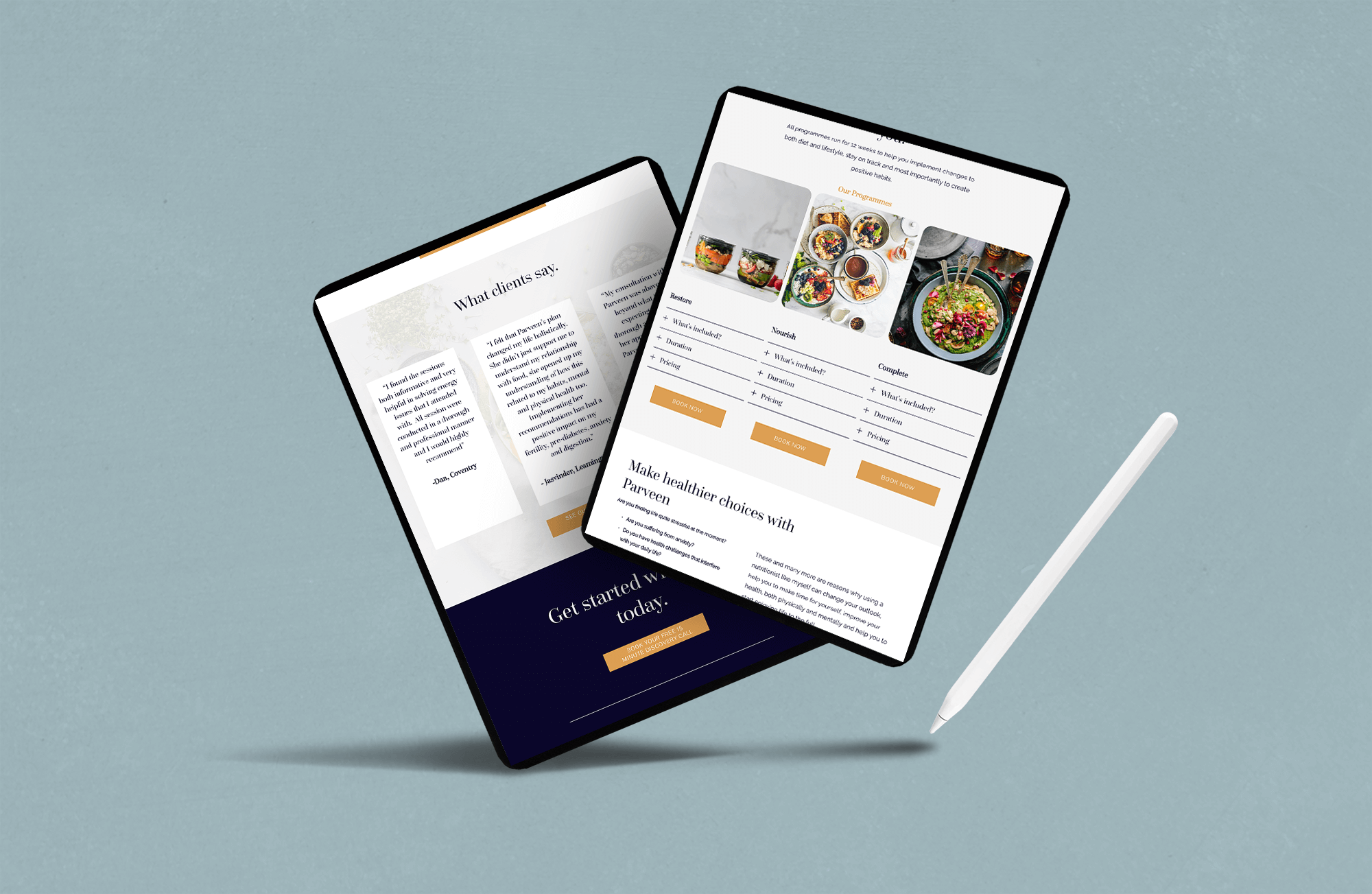
Being one of our favourite website platforms for small businesses, we designed the website in Squarespace. As one of the most very user-friendly platforms, this would allow Parveen to manage her own website with ease going forward.
Designed in line with the new branding, the website was designed to put lots of emphasis on Parveen’s expertise, testimonials and the nutrition programmes available, with little pops of colour helping to keep that warm, welcoming tone consistent throughout the site.
“Parveen’s website works beautifully across desktop, tablet and mobile - which is a big must for any web design project.”
The Results
PRK Nutrition now has a visual brand identity and website ready for its imminent launch. The final design of both the brand and its website are a good example of what every start-up should aim to achieve before launching. See the full website here.


