Bombay Tiimes
Brand ID
Brand, Packaging & Print
The Challenge
Bombay Tiimes, a new ‘East meets West’ influenced Indian street food restaurant required a visual identity to bring to the marketplace, reflective of its Indian Empire heritage with a contemporary British twist.
“Our goal was to fuse traditional Indian stylings with a modern British twist, to really represent the brand and the style of cuisine they’re looking to create”

Our Approach
Authentic Indian food with a clever British twist meant that subtle geographical connections to the east and west were incorporated into the design – the henna symbol and newspaper effect represents the fusion of both cultures.
A striking visual presence in the market contributes to the success of a brand which is why we ensure all our concept work is thoroughly researched and we immerse ourselves into the core values of a brand before begin producing a visual identity.

The Detail
With visions of becoming a leading street food chain in the UK the brand needed to be strong and distinctive, setting Bombay Tiimes ahead of its competition ready for launch. We created a bold, symbolic and enticing logo with a contemporary feel whilst still maintaining traditional elements so as not to lose sight of the brand values.
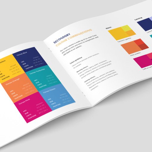
As part of a second brand review exercise, the team then wanted an adaptation of its existing logo to appeal more to consumers in its retail environments, with its current logo to be used only in corporate settings such as in emails and letter heads. We played with their existing colour palette to give the consumer facing branding a more fun, vibrant and quirky feel, appealing to a modern and contemporary target demographic.
The consumer facing logo is almost a stripped back version of the brand’s existing logo, simplified to make it easily recognisable in a busy street food setting.
The Results
The newly established brand now has a strong visual identity, ready to make its mark in a very competitive market.
The Bombay Tiimes brand demonstrates the importance of idealising a brand’s visual identity, and how we at VISUALAB can produce an accomplished trademark for any new or established company.


