Piggy Crisps Brand Identity Creation

The Challenge
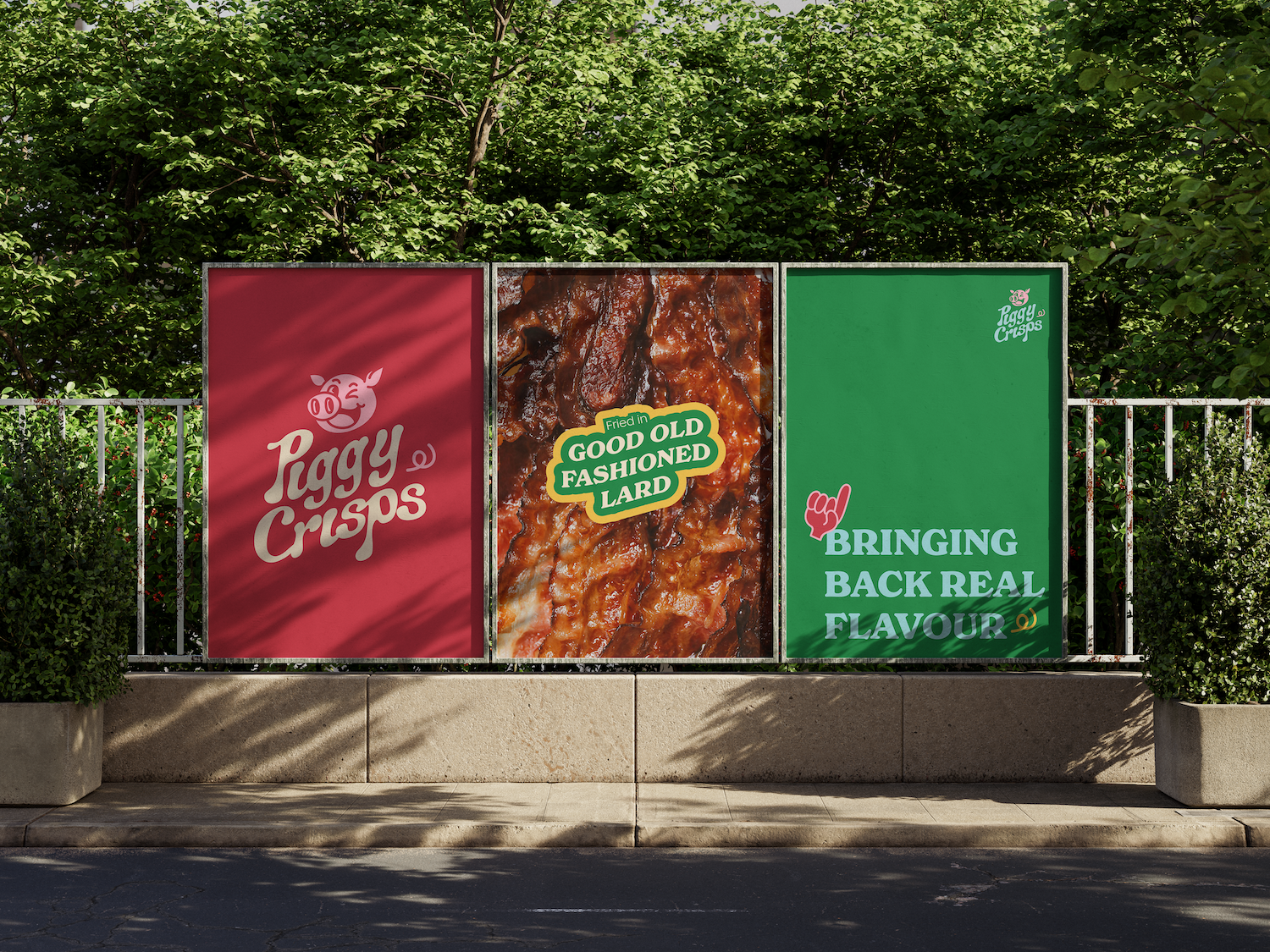
A family-run startup approached us to create a visual identity for their new UK crisp brand, whose unique twist is crisps fried in lard — taking us way back to traditional British snack-making. The brand wanted to highlight its “proudly British” roots, local production, and retro appeal and tasked us with creating a brand mascot that tied into their concept.

“We wanted the design to be as bold and playful as the product itself — nostalgic, yet fresh and vibrant. ”


Our Approach
We Knew from the get-go that we wanted to capture a nostalgic yet modern vibe. We therefore developed a logo that blends vintage styles with a contemporary feel. The colour palette features retro pinks, reds, greens, and yellows — enhancing the old-school feel without losing a bit of modern edge.
We designed a fun and friendly piggy mascot to connect the brand to its pork fat USP, capturing both authenticity and playfulness. The packaging mock-up centres the mascot with bold, retro-inspired typography that adds a fun, visual appeal.
“Blending fun, nostalgia with a contemporary twist, we created a brand mascot that feels like a classic, but speaks to today.”


The Detail
The typefaces and colours were chosen to highlight the brand’s old school take on crisp production, while appealing to today’s modern consumers.
Our packaging mock-up shows off the crisp brand’s unique look — eye-catching, proudly British, and perfectly positioned to stand out on the shelves.
“Our goal was to craft a look that’s proudly British and unmistakably unique, bringing this family-run brand’s story to life.”
The Results
With a complete logo, colour palette, mascot, and packaging mock-up design, the family business now has a distinct identity that reflects its story so far. Ready for launch, the brand is well-prepared to make its mark in the competitive UK snack market.


